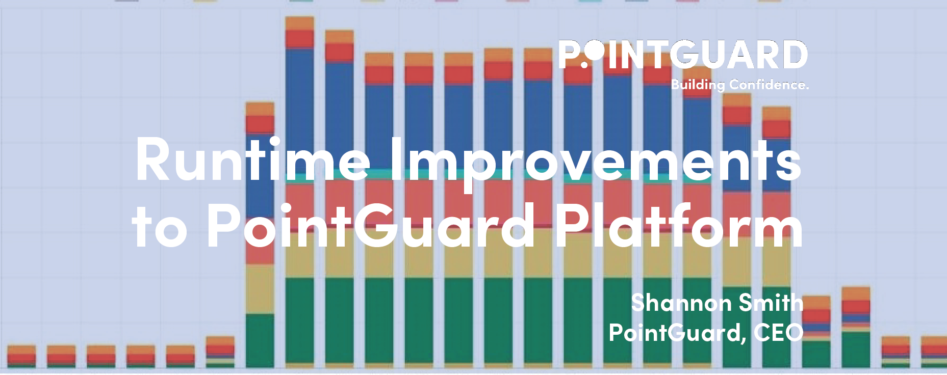
Today PointGuard announced that the PointGuard Platform™ now includes improved visualizations for equipment runtime. PointGuard’s Runtime Visualization addition to the Runtime Analysis page allows for an hourly look at the energy usage in the buildings we serve.
PointGuard continuously works to make tools that building managers and facility teams can use to push their buildings towards high performance, while maintaining both low operating costs and high tenant satisfaction. The Runtime Visualization Graph will help users to identify equipment that is running 24/7 and provide users a visual perspective of where and how their buildings are consuming energy. All the tools available to users of the PointGuard Platform cut down on the amount of time it takes to find and diagnose the most pressing issues in a building, and we are looking forward to the improvements Runtime Visualizations will add to the Platform.
Excessive runtime can be the most energy inefficient and asset degrading faults in a building. Correcting 24/7 or longer-than-necessary runtime allows for an effective start-up and shut-down schedule that saves on daily operating costs as well as long-term capital expenditures.
Additionally, the PointGuard Runtime Visualizations, which mimic interval meter data, have implications for helping buildings avoid peak demand. Depending on the type of utility service in a given building shifting equipment start-up to an earlier, more drawn out schedule can have serious positive operational costs savings.
At PointGuard, we often say nothing good happens unless you know where to turn a wrench. We know facility teams benefit from precise insight into the operating condition of their buildings. Not only knowing hourly energy use, but also having the ability to precisely identity issues with the PointGuard platform gives facility teams leverage to work faster and smarter throughout their portfolios to lower capital and operating costs and improve tenant comfort and satisfaction.